Bioscape Smart Internal Filters Packaging Design
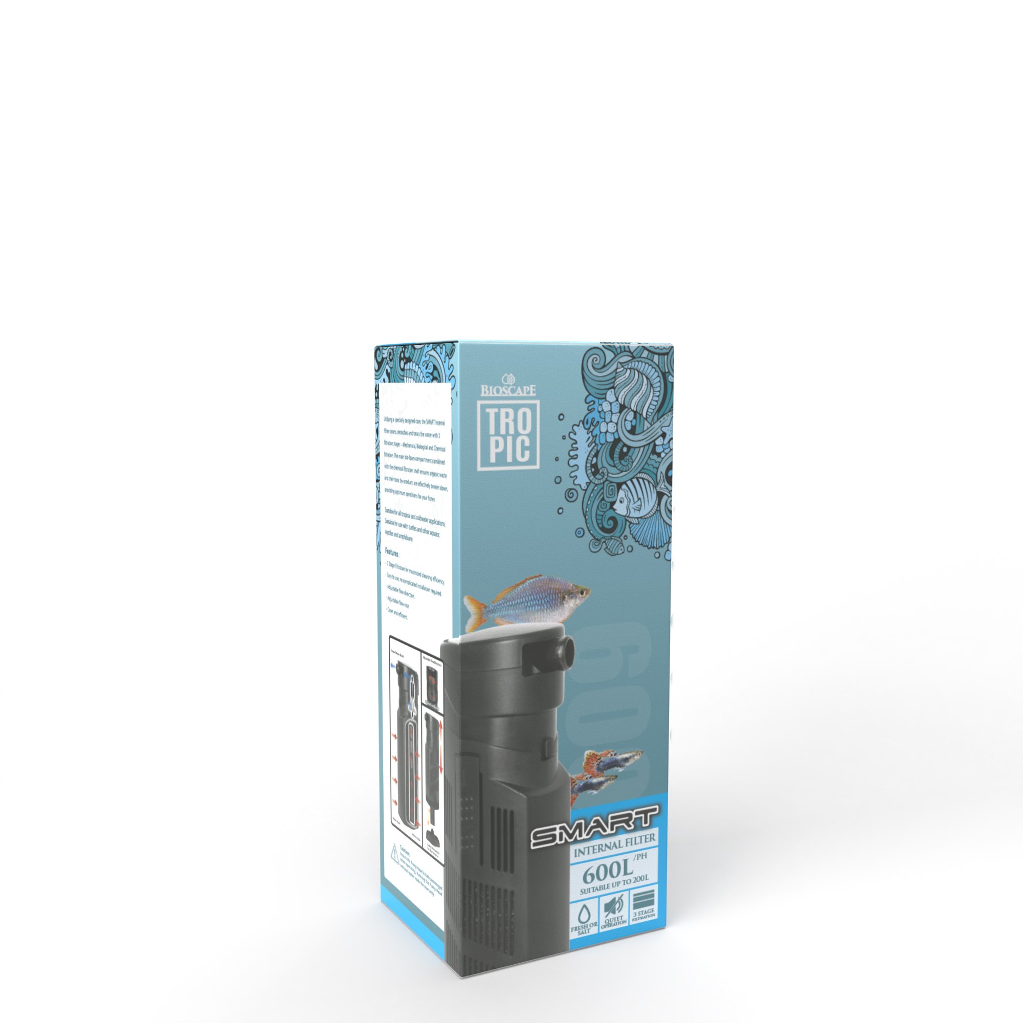
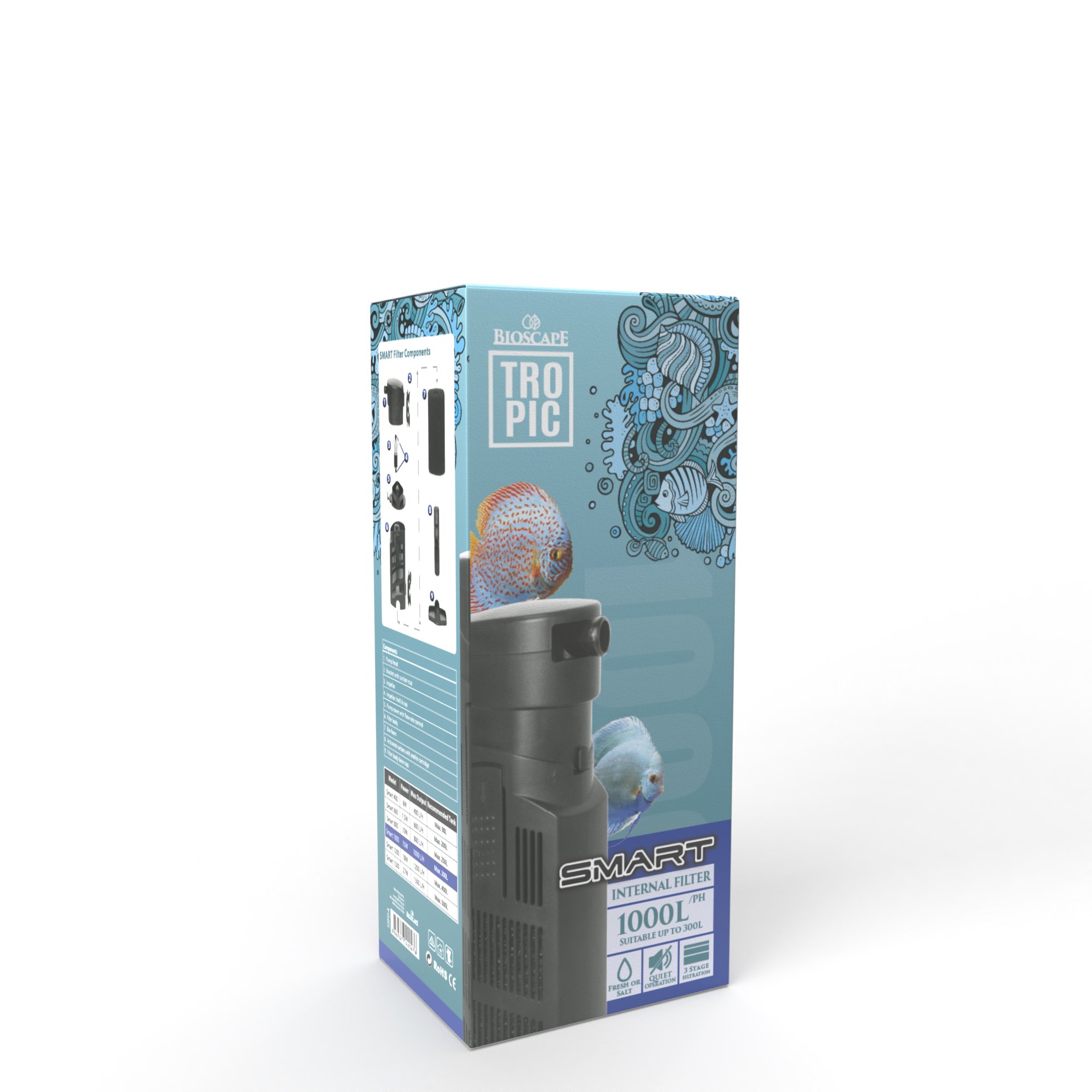
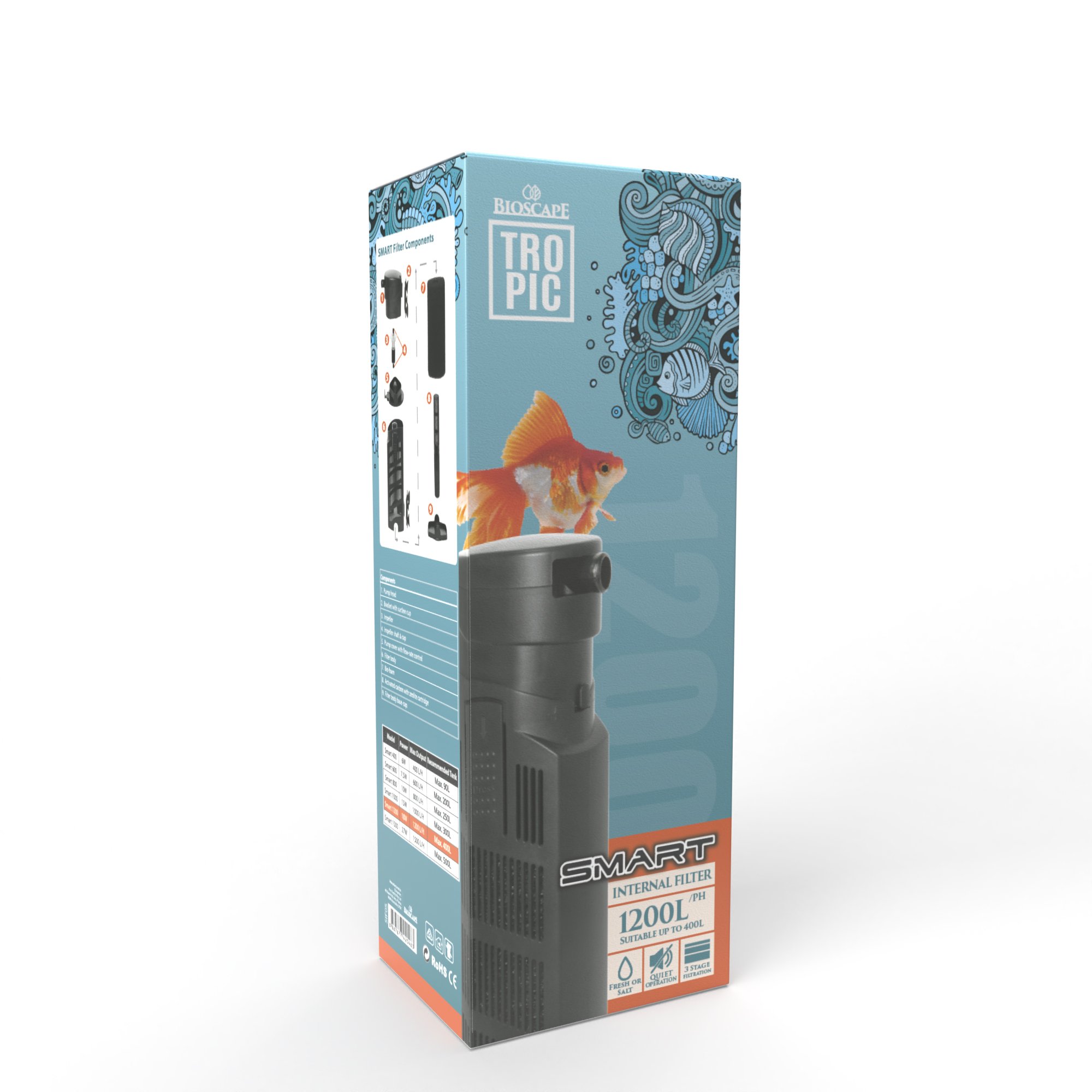
The Bioscape Smart Internal Filters packaging is a visually engaging and informative design tailored to aquarium enthusiasts. The box is adorned with a dynamic teal and blue colour scheme that echoes an aquatic environment's serene and pristine qualities. This choice of colour not only aligns with the product's use but also stands out on the retail shelf, drawing the consumer's eye with its cool, inviting palette.
The front of the box prominently features the product with a high-resolution image that showcases its compact and efficient design, signalling to the consumer the sleek and modern aesthetics of the filter. The product’s features are neatly highlighted, ensuring that the key selling points are immediately apparent.
One side panel serves as an illustrative guide, displaying the smart filter components in a clear, exploded view, allowing customers to appreciate the product’s sophistication and easy assembly. This level of detail illustrates a commitment to transparency and usability in design.
The reverse side of the packaging is dedicated to a concise yet comprehensive narrative of the filter's capabilities. It describes the multi-stage filtration process, adaptable flow patterns, and maintenance ease, all in a manner that is both informative and accessible. Key features like "Adjustable flow direction" and "Quiet operation" are neatly bulleted, facilitating a quick read.
The top of the box is graced with ornate, swirling patterns and marine motifs that frame the "TROPIC" brand logo, suggesting movement and life within the aquatic setting. The entire design is framed with a contrasting colour footer, adding a touch of vibrancy and distinguishing the product line through a colour-coding system.
Also on the box, filters are displayed in multiple sizes, maintaining design consistency across the product range. This approach not only solidifies brand recognition but also aids in consumer decision-making.
My packaging design for Bioscape Smart Internal Filters is a harmonious blend of visual allure, educational content, and market functionality. It speaks to the clarity of my design philosophy – that good design is not just seen, but also informs and resonates with the consumer.